Jim Worthey, Lighting and Color Research
home page contact about me
Jim Worthey • Lighting & Color Research • jim@jimworthey.com • 301-977-3551 • 11 Rye Court, Gaithersburg, MD 20878-1901, USA

"Kaplan-Meier Plot with Many Censored Data"
A discussion relating to the interim clinical testing data on
TNFerade, a Candidate Cancer Treatment from Genvec Corporation.
Written in 2007 June.

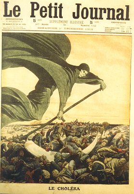
In short: Why does it look like the grim reaper mows down all the patients on day 589?
cholera.jpg

Background:
  The lead drug candidate of GenVec, Inc., a potential cancer therapy called TNFerade, is being tested in patients with pancreatic cancer. At the American Society of Clinical Oncology meeting in Chicago, on 2007 June 2, Mitchell Posner and 9 other authors presented a poster with preliminary data on the clinical testing. So far, patients receiving TNFerade have lived longer than those in the control group, which is encouraging, but more data will be needed for high statistical confidence.

Wall Street not Impressed: The poster was presented on Saturday, June 2, and on Monday June 4, GenVec followed up with a news release and made the poster available on their web site. Later on that Monday, the stock took a big drop. Company management felt that analysts and investors were misreading the data, and issued a further news release on June 5, announcing a conference call on June 6. The stock price has not recovered (as of June 15). At the annual shareholders meeting on June 13, some holders discussed the data with management, and among themselves.

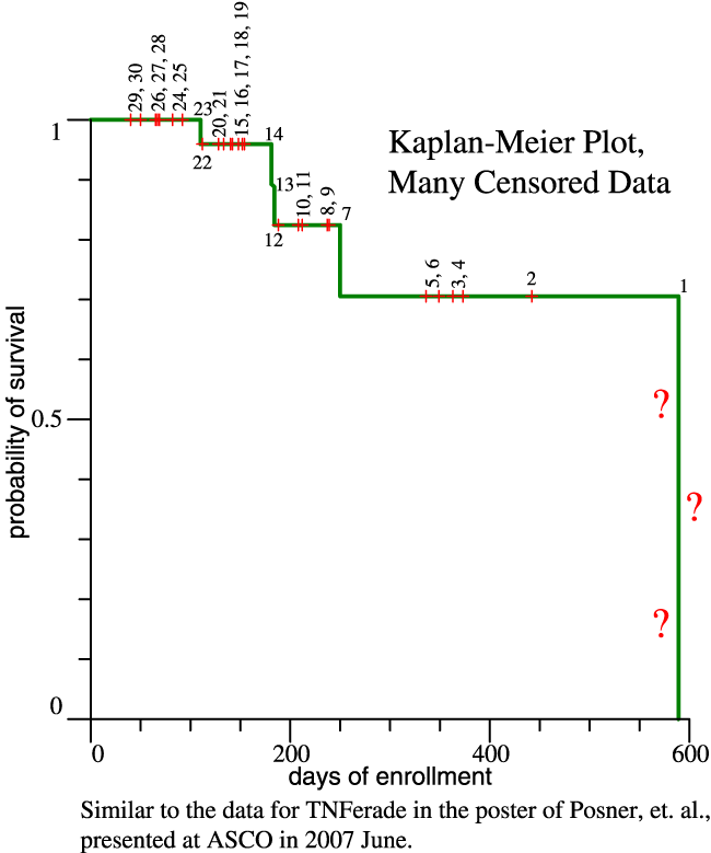
The Kaplan-Meier Plot: The ASCO poster's main graph is in a standard format, and is simple enough when it's explained. However, to a casual viewer, the graph has a disturbing property. Time increases on the horizontal axis until, at day 589, the probability of survival drops abruptly to zero. It looks like all the patients dropped dead on that day. Below is a simplified version of the graph as it relates to patients who received the experimental drug. Data were taken from the original graph, but some information got lost and the version below shows 30 patients, rather than 33.


Please scroll on down for discussion of the graph.

kaplan_meier_explain.png

Experiment Under Way: Patients enroll in the study and begin treatment and evaluation. Time passes, measured in days of enrollment. All patients are alive when they begin treatment. Unfortunately, after 110 days, the first death occurs and later 4 more patients die. Why, then, does the probability of survival drop to zero on day 589? The final drop is marked above with question marks. Why does it look like the whole patient cohort succumbed?

The Kaplan-Meier plot can be used in spite of censored data. Data are censored if a patient is removed from the study, for example by dropping out while still alive. If by some miracle all patients could all be enrolled on the same day, day zero, then the censored data would be mainly patients who dropped out. That is not the case with the TNFerade data reported in 2007 June, which are interim data from an experiment that continues. There are many censored data because patients enrolled, one at a time, during at least 550 days.

Patients are indicated in the graph either by a drop in the green line, or by a tick mark. I have used + signs as non-standard tick marks, where thin vertical lines would normally be used. A drop in the green line indicates a death, while a tick mark indicates censored data. Numbers have been added to indicate the patients in (approximate) order of enrollment. Only 30 patients were found, perhaps because of superimposed tick marks on the original graph. Patient 1 was first to enroll, and he unfortunately died on day 589 of his personal TNFerade experiment. Patient 2 enrolled 442 days before the data collection, so he is censored at day 442; we know that he survived that long. He might have died on day 443, he might be out playing golf, we know only that he survived 442 days. Patient 3 enrolled 69 days after patient 2, so our knowledge is censored after 373 days. Since other patients enrolled later and later, we have fewer and fewer days of knowledge concerning patients 4, 5, 6, 8, etc. Patient 7 is not censored, because he died, as did patients 13, 14, and 23. So, 5 patients died, and the other 25 are censored. The interim evaluation leads to many censored data.


Now look at how the survival probabilities are calculated. When patient 23 died on day 110, he was one of 23 to have lived at least 110 days. Therefore the survival probability then was 22/23 = 0.957. The drop is 1-0.957 = 0.043. When patient 14 died on day 181, the survival probability is estimated as (22/23)*(13/14) = 0.888. The drop is 0.957-0.888 = 0.069. The drop is a little sharper, because patient 14 was a member of a smaller sample. Finally, as it happened, the patient who enrolled first did die after 589 days. With all the other patients censored out, or deceased, he was a sample of one and the whole sample died. If the first-enrolled patient had continued to live until the data collection day, then the graph would end with a tick-mark and not with the sharp drop to zero.

For more detail, see the Wikipedia article on Kaplan-Meier. In the example there, the censored data are fewer, except that the experiment ends with many patients still living.

Technical issues: For patients represented by tick marks, we have approximate knowledge of when they enrolled, measured in days before the interim data collection. (The data were "collected" from the routine record of each patient's most recent clinic visit.) When a patient died, that limits our knowledge of when he enrolled. Putting those ideas together, the patients may have enrolled in a different sequence, not exactly as numbered or as implied by the text. The numbers were added for explanatory purposes and are not part of the original presentation.

Disclaimer: The purpose of this web page is to explain the Kaplan-Meier graph for readers who may be well educated, but are not statisticians or clinical researchers. The discussion is based on public information and was not authorized by GenVec. Nothing above is intended to quarrel with the data, or with any person. On the other hand, the discussion is intended to make sense, and I welcome any suggestions to improve it. Jim Worthey

Jim Worthey Home Page, http://www.jimworthey.com
Copyright © 2007 James A. Worthey, email: jim@jimworthey.com
Page last modified, 2007 June 16, 01:35