|
1
|
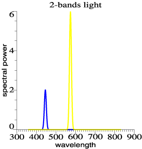
A white light can be made
that emits all its power in two narrow bands: one in the blue and one
in the yellow region of the spectrum. This graph shows a 2-bands light
as used to make Figure 1 of the introductory article. (Here I have
broadened the bands a little for a prettier drawing.) |
 |
|
|
2
|
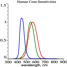
The two bands suffice to
make a colorless light because the yellow band by itself stimulates two
receptor systems: the red-sensitive cones and the green-sensitive
cones. The green and red sensitivities overlap, and any wavelength in
the vicinity of 550-580 nanometers will stimulate both types of cone
quite well. The blue band stimulates the blue-sensitive cones.
Stimulating all three cone systems is just what a normal white light
(such as daylight) would do.
The drawing shows human cone sensitivities computed as linear
combinations of the color matching functions of the CIE 2°
observer. For tabulated cone fundamentals and other data, see http://www.cvrl.org/. |
 |
|
|
3
|
When used to illuminate
colorful objects, the two-bands light loses reds and greens, turning
them into browns and blacks. Other colors become yellows, whites, and
blues. This figure is essentially the same as Figure 1 of the
introductory article. |
 |
|
|
4
|
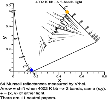
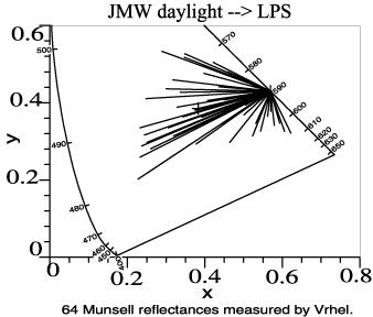
Another good example is a
one-band light that is occasionally used for street lighting: the
low-pressure sodium light. Under this light, all objects take on the
same chromaticity, (x, y) = (0.569, 0.430). This graph shows a
transition from daylight at 4002 K to low-pressure sodium light. |
 |
|
|
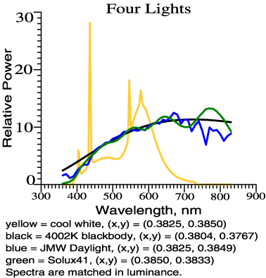
5
|
Figure 2 in the
introductory article displays a basic example, comparing 4
color-matched lights, as follows:
- One ideal of "normal"
lighting is
the spectrum of blackbody radiation, which is computed from a formula
derived by Max Planck. The single parameter, temperature T,
determines if the blackbody radiation is yellowish or bluish; in the
figure, T = 4002 K.
- Daylight, meaning direct
sunlight
plus light from the sky, is not blackbody radiation, but it is similar
to blackbody if the two lights are selected to match up in color.
Daylight is certainly a benchmark for normal lighting.
- A commercial light
(filtered
tungsten-halogen) that was designed to resemble daylight or blackbody
at 4000 K.
- Finally, there is the
spectrum of
Cool White Fluorescent, which rises above the others in the yellow and
blue, but falls short in the red and the green.
This figure is
rich in
facts; it shows by a realistic example why color rendering is
an issue. The only "theoretical" content is in the textbook colorimetry
used to match up the lights in color and illuminance. A few other
figures in the two articles present similar color-matched comparisons
of light source spectra.
|
 |
|
|
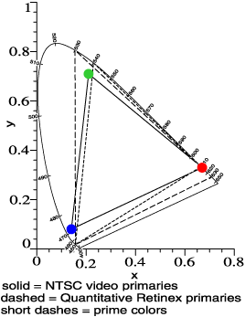
6
|
We all know that daytime
vision is "trichromatic." The 3 cone types in the retina are echoed in
the 3 pigments of color film, the 3 colored inks (plus black) of an
inkjet printer or a magazine page, the 3 phosphors of color TV.
Research shows that certain ink or phosphor colors work best; they
can't be chosen arbitrarily. [See R. W. G. Hunt's book, The
reproduction of color. I have the 3rd edition, published in 1975
by The Fountain Press. A sixth edition is forthcoming in 2002 August.]
Dr. William Thornton has found a set of 3 "prime colors" that work best
in a 3-band light source, and not surprisingly they are similar to the
phosphor colors of NTSC television (colored dots). In words of one
syllable, Thornton seeks to use the hues with the most punch. I have a
similar goal, but start with opponent-color ideas to develop a method
not restricted to 3-band lamps. |
 |
|
|
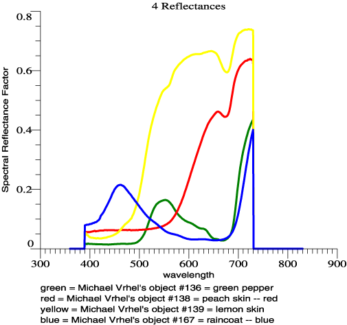
7
|
Most solid objects have
reflectances that vary slowly with wavelength, showing one or two
smooth transitions between low and high, within the visible spectrum.
While this was "discovered" by Jozef Cohen in 1964 in a useful
mathematical form, it is often implicitly assumed in color work. Cohen
brought the idea out in the open, and I use a version of his formula to
bring the spectral smoothness of object colors into my analysis. The
objects that you might see are numerous, but here are spectral
reflectances of 4 surfaces that Michael Vrhel measured: |
 |
|
|
8
|
Given a single object
viewed by the CIE standard observer, the tristimulus values of the
object can be computed for any light. Some color scientists feel that
if the tristimulus values can be found for any light and object, this
is all one needs to know, and there is no color rendering issue. This
shows a charming and innocent faith in basic colorimetry, but it is not
correct. In daily life, even in daylight, the color of the light
varies. A bluer light shifts chromaticities towards blue; a yellower
light shifts them towards yellow. (See calculation article, Figure 4.)
The eye has an (imperfect) mechanism of "color constancy," so that one
sees object colors as stable, even when object chromaticities are
shifted. A single object's tristimulus vector, by itself, does not
predict the perceived color of the object. A color rendering discussion
must in some way deal with color constancy, and the two new articles do
this:
- by comparing lights that
have the
same chromaticity (exactly or approximately). According to most
theories, the light's chromaticity steers the constancy mechanism.
Comparing lights of the same chromaticity should keep constancy out of
the picture.
- by plotting colorimetric
shifts
for large numbers of color chips (64 or 36 in most cases), rather than
one or a few object colors. Plotting a large number of colorimetric
shifts in one drawing displays "the forest" as well as "the trees," you
might say.
- by referring to color
contrast and
saturated chromatic colors, not just color shifts.
- by presenting a
calculation based
on opponent colors, to keep the issue of saturated chromatic colors in
plain view.
|
|
|
8½
|
Item 8 can be repeated in
a simpler way. Again, the issue is that for a single spectral
reflectance under a single light, textbook colorimetry enables
tristimulus values (X, Y, Z) to be computed, and then chromaticity (x,
y). Why then is another discussion and calculation needed for color
rendering? For a direct answer, look at the graphs in items 3 and 4
above. Lights can have strong systematic effects. A color rendering
calculation is needed to describe and quantify these systematic
effects. One tristimulus vector, or even the shift of one tristimulus
vector when the light is changed, does not convey the systematic loss
or gain of chromatic colors that can occur. |
|
|
9
|
In reviewing drafts of the
color rendering articles before publication, various scientists have
made suggestions with a common theme. They would like me to project
colorimetric shifts into a nonlinear color difference space such as
CIELAB, or relate my results to some color appearance model. That is
not what this work is about. In everyday life, vision involves 3
actors:
1. The object.
2. The light source.
3. The eye and visual system.
Most studied is the visual system. It is fascinating and complex and
the study of the visual system connects to the large occupational
communities of optometry and medicine. Objects connect to smaller
occupational groups relating to pigments, copy machines and so forth,
and objects are studied in a moderately scientific way. What is highly
neglected is the light source as an actor in the visual process. For
instance, vision scientists occasionally study Color Constancy, in
experiments such as that of McCann, McKee and Taylor, discussed in my
introductory article. Such studies must vary the light, but most
authors say little about how one light differs from another. The
scientists are being paid to talk about eyeballs. They may receive
money from National Institutes of Health. They don't know about lights
and are not being paid to think about that.
My goal from the
beginning has been to focus on the neglected issue: how do lights
differ from each other and what are the effects of these differences?
Above all, the light acts in the linear, physical regime where it
shines upon the objects, the object properties interact with light
source properties, and the resulting object radiances then interact
with the receptors of color vision. I make two assumptions about the
eye:
1. All sensation must be mediated by the 3 spectral sensitivities of
cones. (Leaving aside scotopic and mesopic vision.)
2. Color vision is stimulated when different retinal areas receive
stimuli that are well separated in color space.
If a light causes reds to lose their redness and also causes greens to
lose their greenness, it is important to know this. It is important to
understand this as an issue in itself, and not to drag in other issues
that are well studied already. The introductory article looks at the
basic facts of color rendering in a workmanlike way, as no other author
has done. (See items 1-5 above.) The mathematics used in the second
article is appropriate to the color rendering problem as it actually
exists. That should be enough for now.
|
|
|
|
|
|